Shipsi
RE-BRANDING A VISIONARY TRANSPORT INTELLIGENCE COMPANY
The Client Context
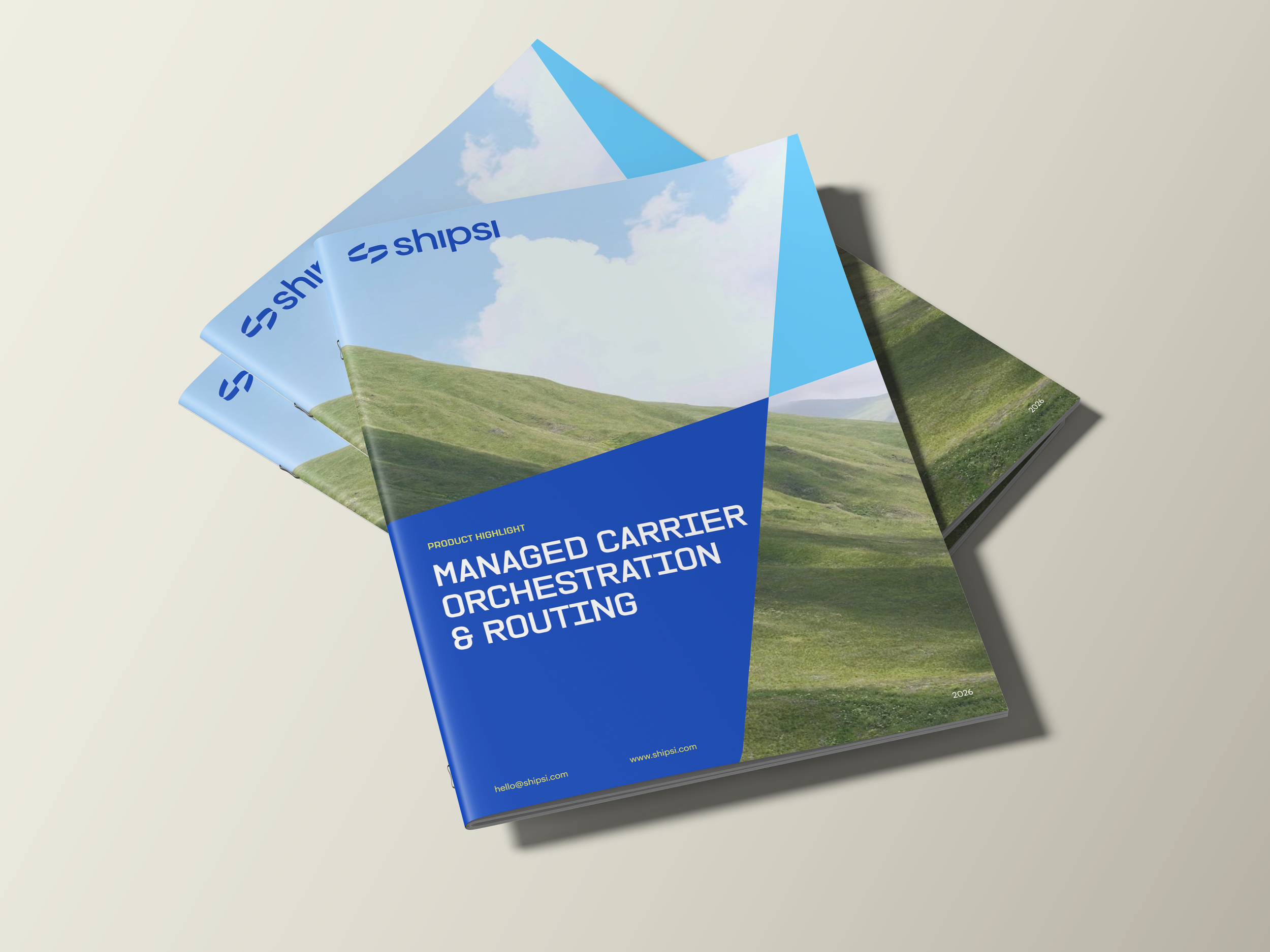
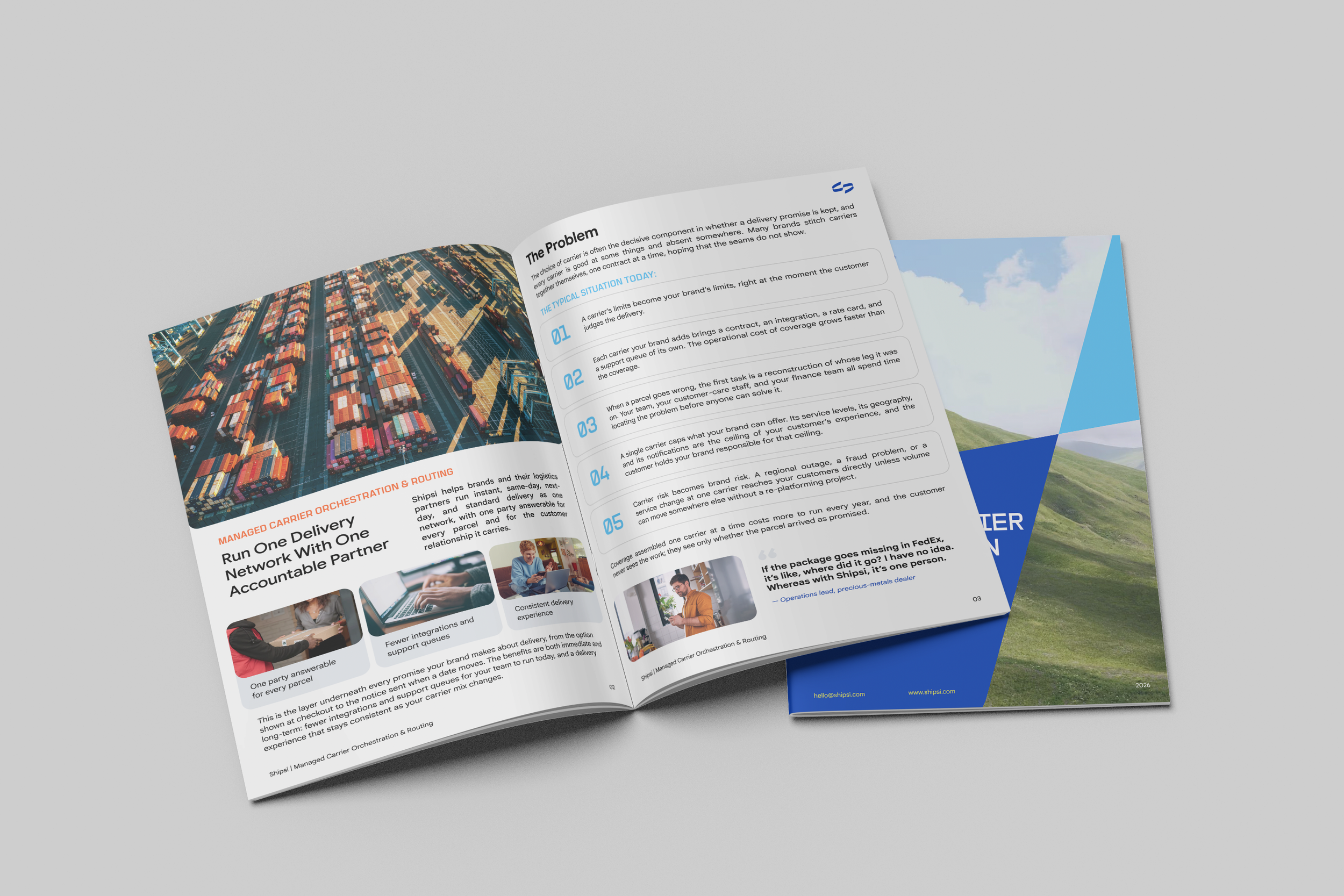
Emotif partnered with Shipsi, a next-generation transport intelligence company, to redefine its brand strategy and positioning, establishing a strategic foundation for its next major evolution and long-term ambitions. Building on this foundation, we developed a distinctive visual identity and comprehensive design system spanning typography, color, graphics, patterns, photography, and brand collateral. The result is a compelling, cohesive brand world designed to communicate Shipsi’s innovation, capability, and vision while positioning the business for its next phase of growth.
Brand Overview
Forging Stronger Connections
We live in a world in constant motion.
At any given moment, of any given day, there are 1-2 billion packages in motion globally. Each one passing through the world’s warehouses, distribution centers, and logistics hubs on its way to its destination.
All that physical infrastructure is only as smart as the digital infrastructure that it runs on. Each package carries with it a series of goals, expectations, and constraints.
Shipsi provides the technology rails that bring together those insights and the physical logistics data in order to give shippers and customers a better overall experience: bringing brands closer to their customers through a delivery experience that feels seamless, reassuring, and human.
For our business partners, Shipsi is more than infrastructure behind the transaction. It is a way to strengthen their relationship with the people on the other side of the order — helping brands deliver not just products, but confidence, care, and connection.
Our brand identity is designed to express that idea.
Shipsi moves brands forward by helping them move closer to their customers.
What We Did:
Brand Strategy & Positioning
Visual System Development
Brand Guidelines Book
Copywriting
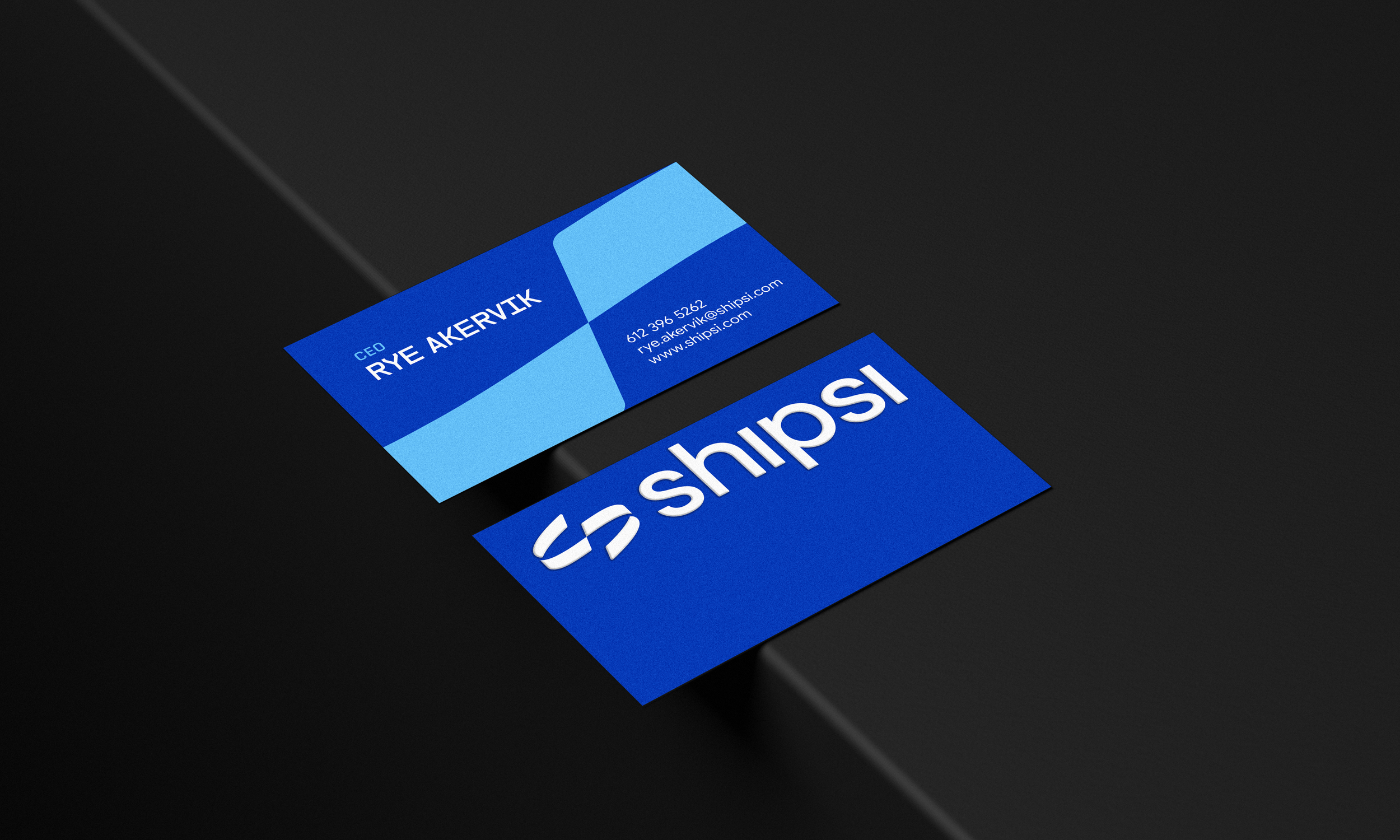
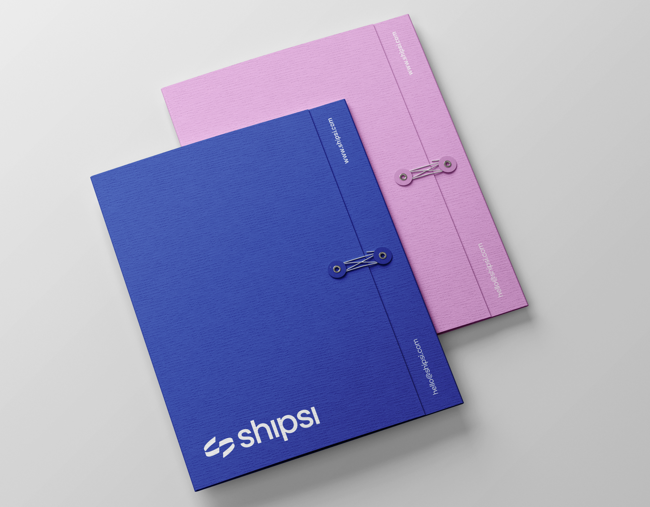
Brand Collateral Design
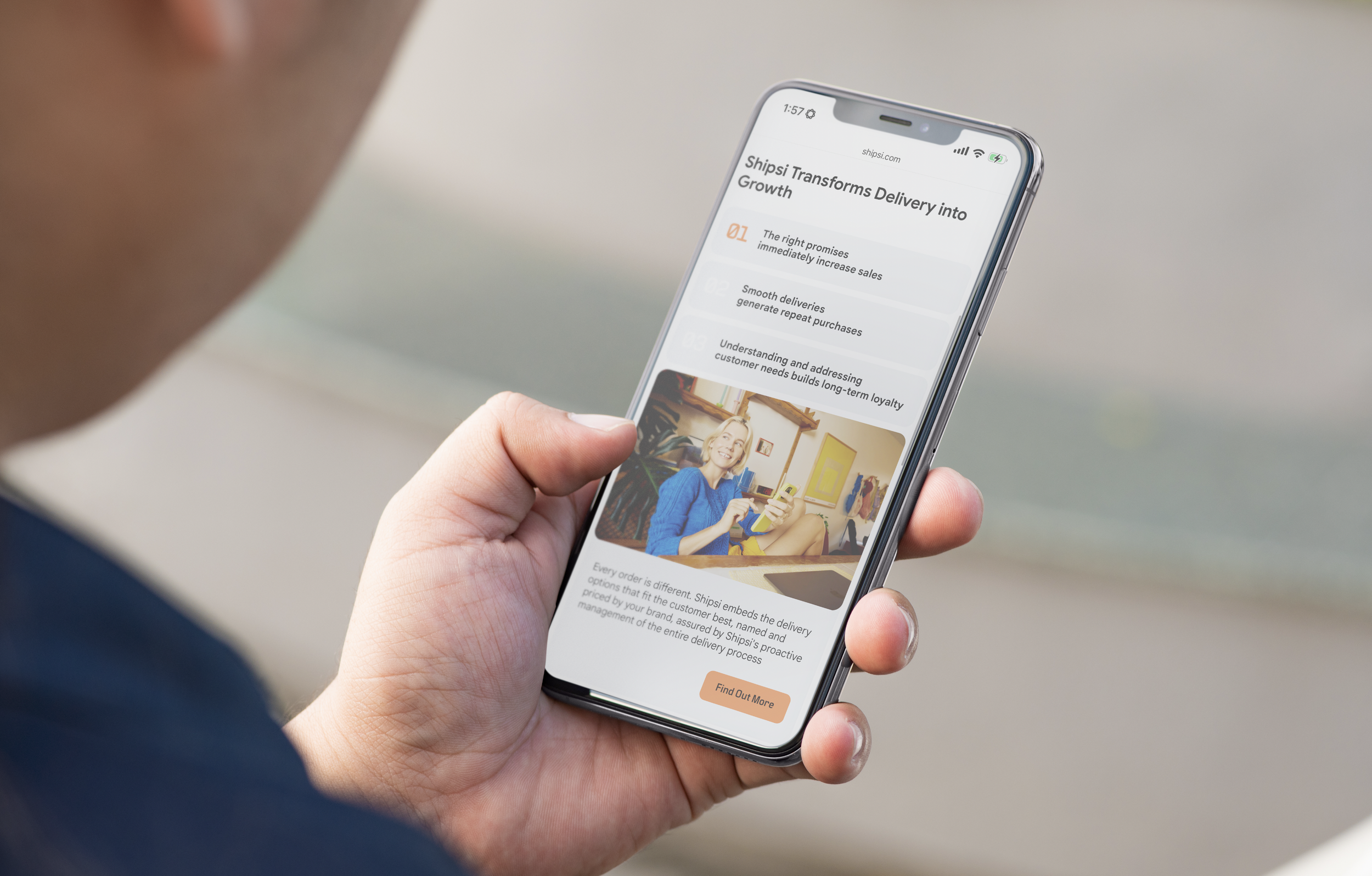
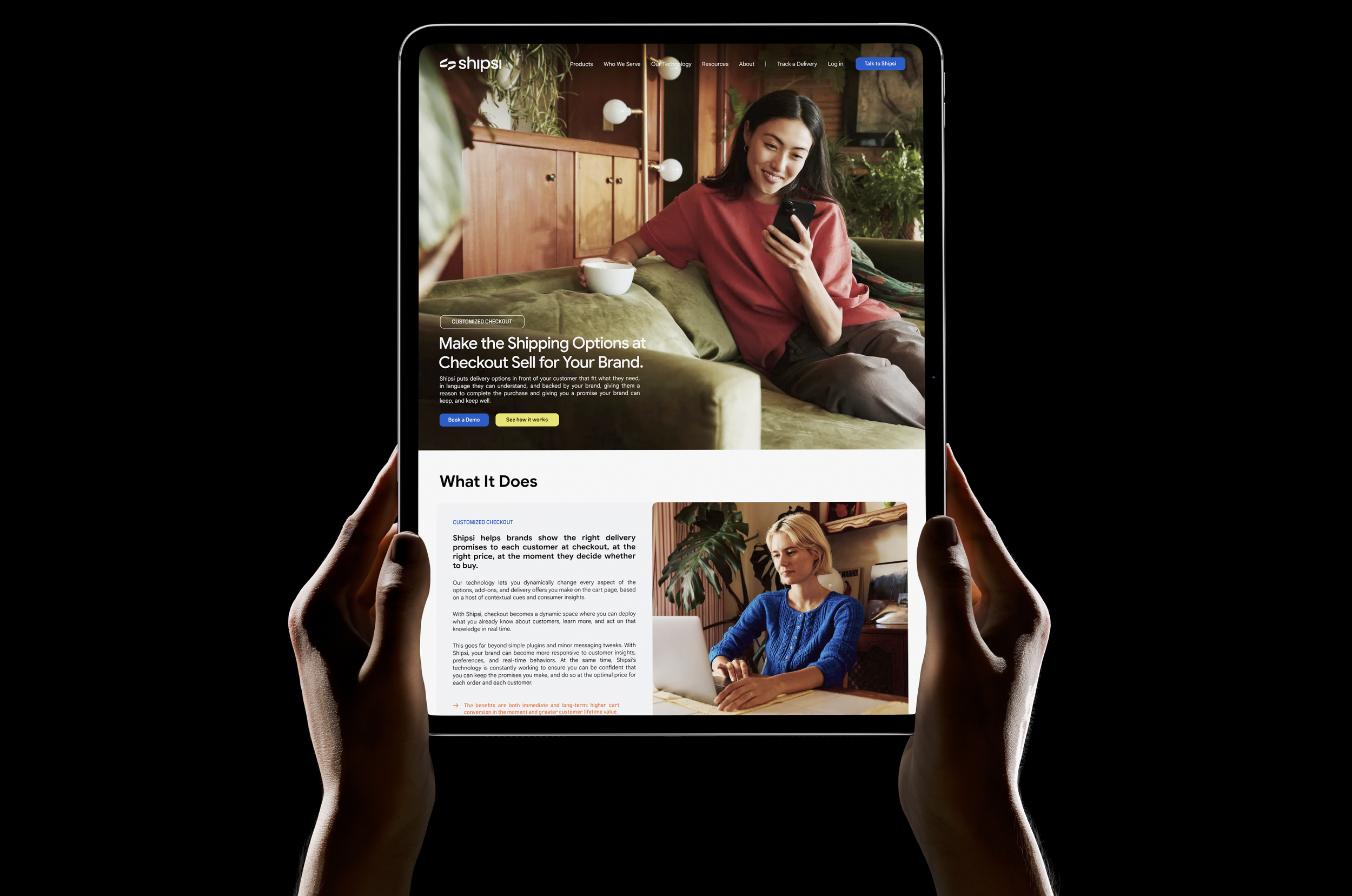
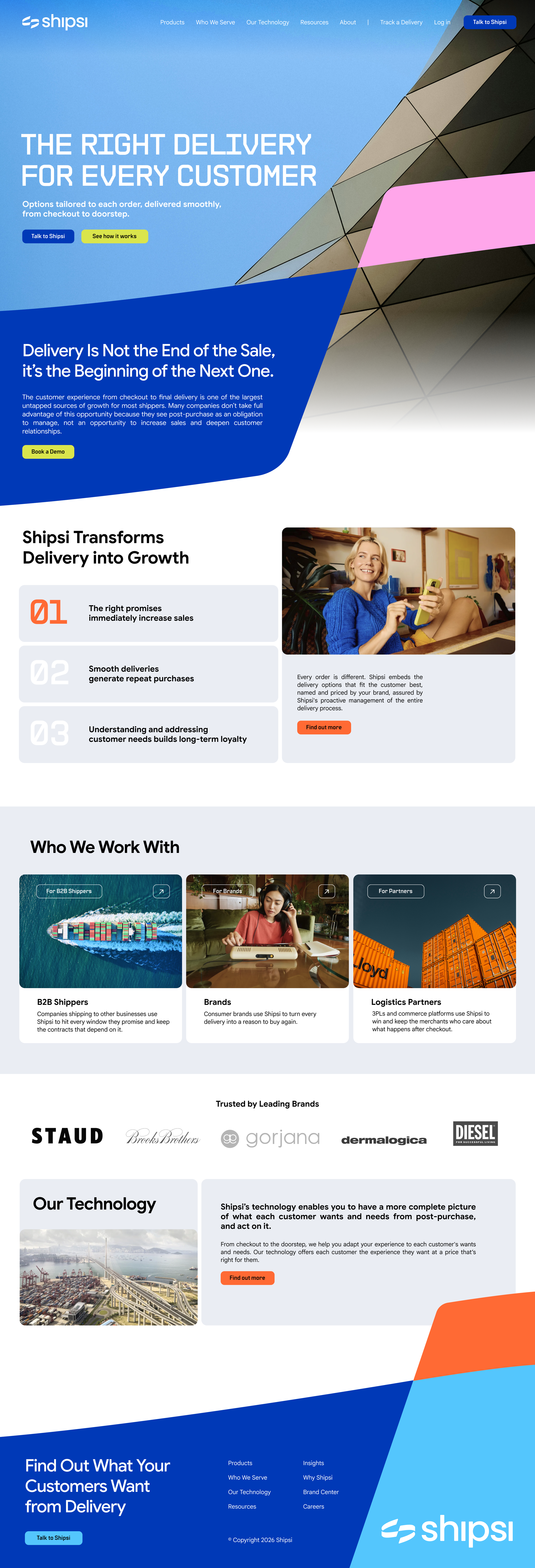
Website Design
Social Media Strategy & Management
Industries:
Technology, Corporate, Startups
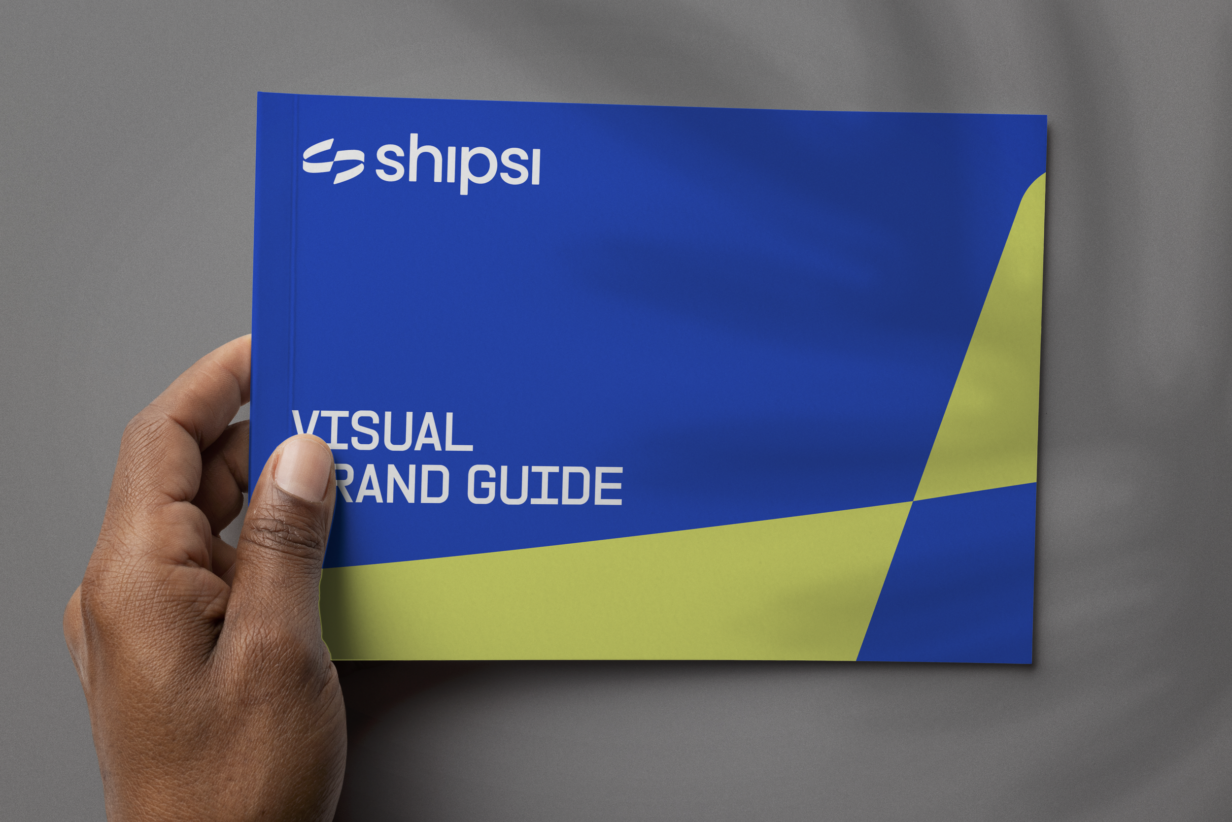









Visual System Overview
We infuse life and humanity into the Shipsi visual world, balancing the precision and capability of technology with a sense of warmth, movement, optimism, and ease. Inspired by the curvilinear forms of our logomark, the identity moves, folds, loops, and connects. It feels dynamic without feeling complicated; expressive without losing sophistication.
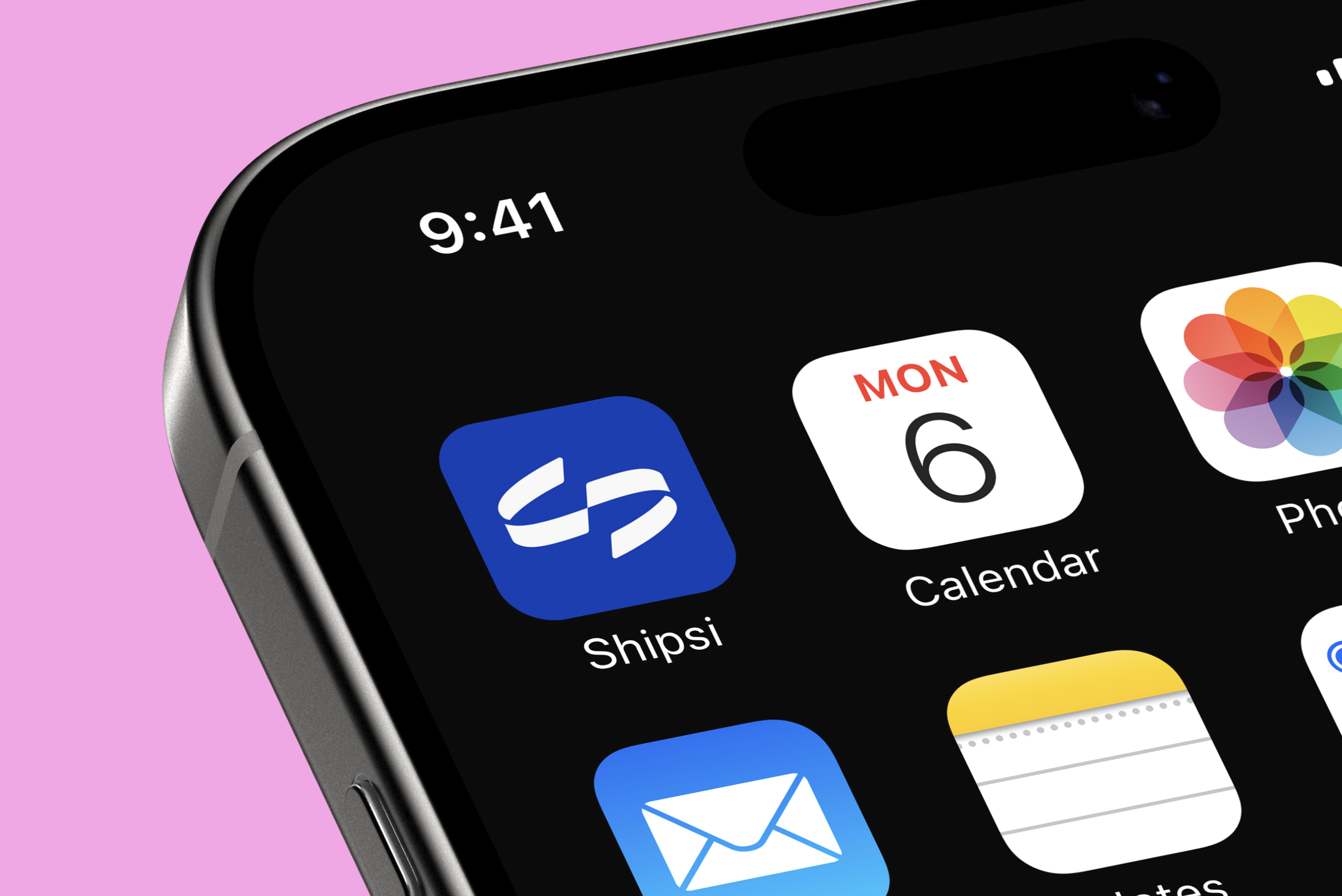
At the center of the system is our symbol: a perfected core connection. Its folded-ribbon form suggests continuous movement and an interconnected path, while its aligned, inclined cuts introduce a sense of forward motion. The softened edges of our wordmark echo the character of the symbol, creating a cohesive visual language that feels capable, approachable, and distinctly Shipsi.
Typography becomes an important design code within that language. Our type system is a stylish accompaniment to the logo kit, complementary rather than duplicative. Across our three type selections, characteristics drawn from the logo are translated into letterforms, creating contrast and hierarchy while maintaining a recognizable point of view. Typography can command attention when messaging matters most, while remaining flexible enough to support the broader visual system.
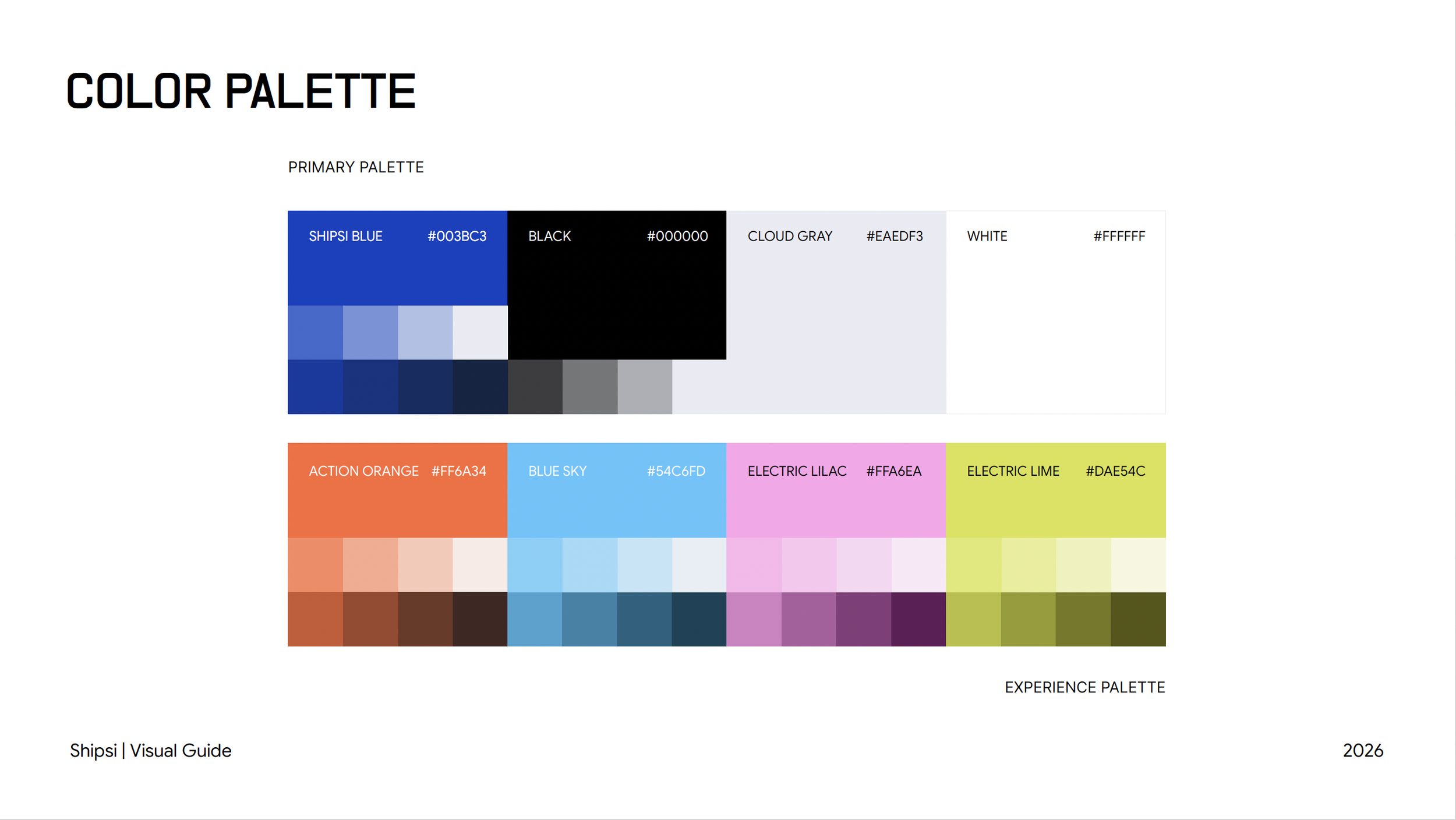
Color brings energy and emotion to the brand. Our palette is vibrant, optimistic, and full of life, curated around feelings of comfort, assurance, joy, and anticipation. At its center is Shipsi Blue — an assuring cobalt that provides stability and trust. Around it, an expressive supporting palette introduces warmth, vibrancy, and moments of delight. Together, these colors allow the brand to move fluidly between dependable and energetic, confident and human.
Our graphics system gives the brand a sense of movement and possibility.
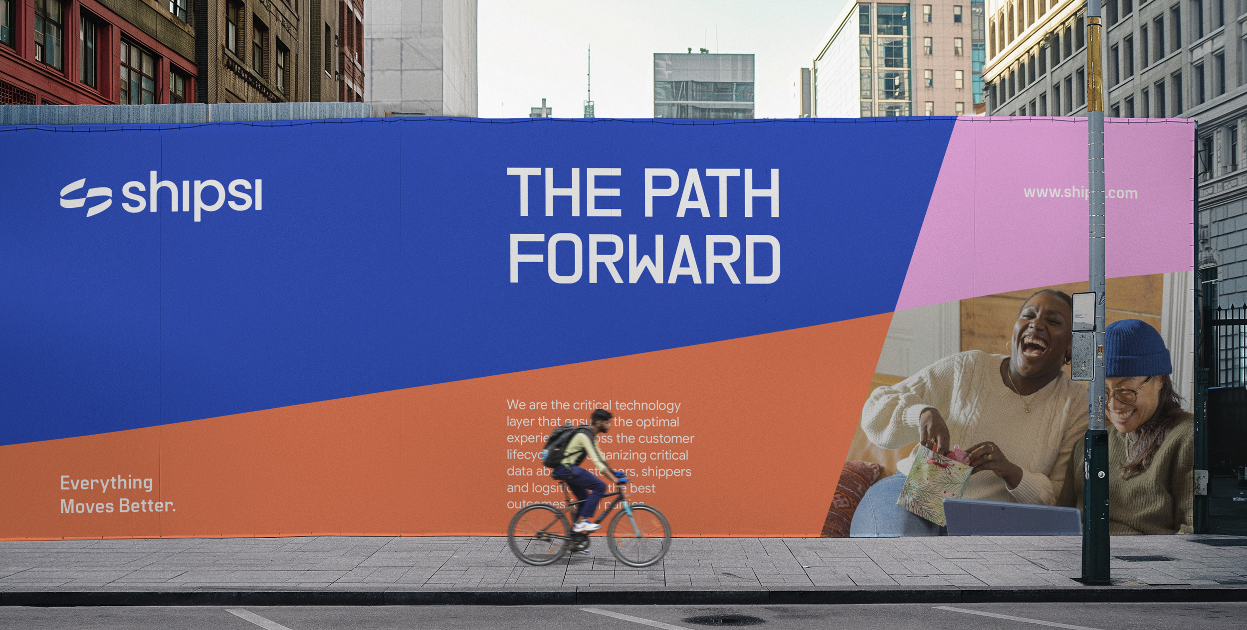
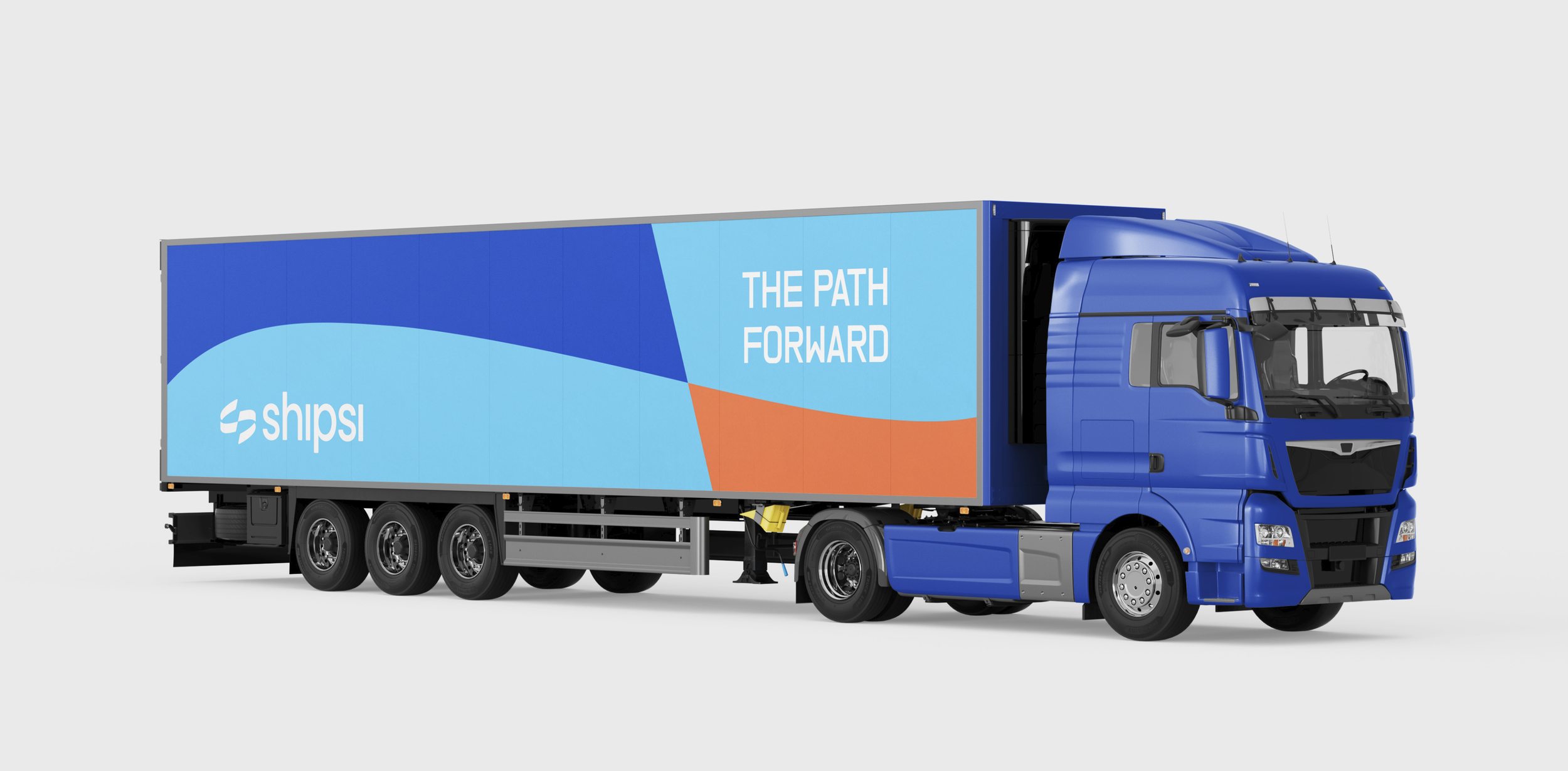
Called The Path Forward, these undulating forms take their cues from the Shipsi symbol, referencing landscapes, routes, transit, and the continuous movement of a package from one place to another. They can appear at a micro or macro scale, giving the system the flexibility to respond to everything from a subtle interface detail to a bold brand expression. The result is a graphic language that feels alive, always moving forward, always connecting what comes next.
Photography extends this emotional world into real life. Our color palette informs the visual treatment, while imagery prioritizes people, products, environments, and moments of connection. We intentionally hero our partners’ packaging rather than relying on generic brown boxes. Their brands are the protagonists of the story, reinforcing Shipsi’s role as the technology that helps them show up for their customers.
Together, our graphics system, color palette, typography, grid layouts, and imagery direction create an expression that is energetic, friendly, and refined. It is sophisticated enough to stand alongside the brands we serve, not beneath them or behind them, but alongside them as a peer.
Our B2B partners see a brand that reflects their own ambition, taste, and commitment to customer experience. A brand that understands that the last mile is not simply about moving something from A to B. It is another opportunity to build trust, create a positive experience, and bring a customer closer to the brand they chose.
Every Shipsi design code — from our symbol and softened wordmark, to our colors, typography, graphics, imagery, and layouts — works together to make that idea recognizable.